Kayla’s Bridal Shower

Kayla has been my friend since I was 14 years-old. She recently told me she is getting married and the first thing that came to my mind was to organize a bridal shower for her!

Between her, Erika (another friends,) and I, we are dividing the responsibilities of the event. I am in charge of the fun stuff and the dessert. I want to include some designs I have done for this big day. I will be including some pictures from the shower once the day comes and it will be posted in a different category (The Fun Time – coming soon!)


Project 9: Portfolio


Project Corrections / Time spent: I spent an hour and 45 minutes redoing my Photo design project and improving my Brochure project. I created a brand new Photo design, using a different image and different theme. In my brochure, I changed a photo to create a text wrap.

Message: My message shows different projects I’ve created in one portfolio so professionals will be able to see my work and who I am as a person.

Audience: Potential Public Relations clients and employees.

Top Thing Learned: I learned how to use some of the Adobe programs including InDesign, Illustrator, and Photoshop.

Future application of Visual Media: I will be able to know how to fix and create projects so that it is a good visual to the eye.

Color scheme and color names: Monochromatic- Brick.

Title Font Name & Category: Janda Elegant Handwritting- Script

Copy Font Name & Category: Century Gothic- Modern

Thumbnails of Images used: All was personal creation.

Sources (Links to images on original websites / with title of site):


Brochure Dreamer Events

Front 
P8-MariviRueda-front

Inside
P8-MariviRueda-inside

Back

P8-MariviRueda-back

Video Showcase

  1. Description: Two sided pamphlet presenting a family business.
  2. Process (Programs, Tools, Skills): I created my logo using Adobe Illustrator. I thought about adding the moon next to the name of the company. This way, there is a contrast between the name of the company and the logo. I decided to add the cloud around the moon and title of the company to keep it all in one spot. I chose to do a big split complementary using the colors teal, gold, violet and brick. Once I chose my color scheme, I started using the colors in the logo. Then, I started using InDesign to create the layout of my brochure. The brochure is divided in half (along the width) and divided into three side (along the length.) The purpose of the layout is to create a semi-square, rather than a rectangle. I wanted to keep my brochure simple but at the same time elegant. This way, it gives a message of simplicity and elegance which is what the company is all about. I gathered the pictures I wanted to use, and started typing the script. I kept the script to be five different paragraphs so that each paragraph speaks about something the company do. I added a background color (brick) with the shape tool and then a gold rectangle at the bottom of the brochure. This keeps the brochure on one side (instead of moving it sideways.) I created some text boxes, added the script and the title section and began playing around with it to see where it would fit better. Lastly, I change the color of my text to keep the color scheme repetitive and aligned every picture, text, and title with everything.
  3. Message: To demonstrate a family business that gives quality product.
  4. Audience: Families, mostly mothers (who are the ones in charge of creating events.)
  5. Top Thing Learned: I learned how to create a layout for a brochure.
  6. Color scheme and color names: Big split complementary: Teal, gold, brick, and violet.
  7. Title Font Name & Category: Housegrind Personal Use only
  8. Copy Font Name & Category: Minion Pro
  9. Word Count of copy: 283
  10. Thumbnails of Images used:
  1. 10669322_10204998955478798_3207860098011431308_o
    food

    food

    centerpiece 2
    MAC_7850


9. Sources (Links to images on original websites)

1. Personal

2. https://www.flickr.com/photos/twicepix/4269438076

3. https://www.flickr.com/photos/10285404@N06/9672249835

4. Personal

Web Page

P7MariviRuedaSS

  1. Description: A web page describing the process of creating a logo.
  2. Process (Programs, Tools, Skills): The only program I used was Notepad++. I had a little bit of background knowledge about HTML, so I knew the basics. Yet, when we were introduced to CSS, it was a whole different language for me. After playing around with both (HTML and CSS,) I got the hang of it. I really enjoyed doing this project. The design part of it was a little difficult to organize because there was so much that could be done. I had a hard time getting the right size for the logo. Until I figured the problem that was causing me to not have the size that I wanted. I had to delete a code in CSS in order to play around with the size of my logo. I decided to keep the title of the webpage in a different typography than the rest of the body copy. I felt like it made it stand out more. Also, I did this so that there could be a hierarchy between all sections of the webpage. The colors of the webpage were based on the colors of the logo. That created a simple flow of both colors and design.
  3. Message: The company’s message is to create the event of everyone’s dreams.
  4. Audience: Anyone who wants or needs someone to plan their social event.
  5. Top Thing Learned: How to distinguished and read HTML and CSS code.
  6. Color scheme and color hex(s): Complementary – Teal and Brick
  7. Title Font Families & Category: Rage Italic – Script
  8. Copy Font Families & Category: Century Gothic – Sans Serif
  9. Changes made to the CSS: I changed the font families, and background (put an image rather than solid color.)
  10. Word Count: 426

Stationery Dreamer Events

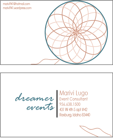
Letterhead: P6MariviRuedaLH

Business cards (8.5 x 11 in layout)

P6MariviRuedaBC
Business cards (large layout)

large

Color scheme and color names: Complementary – Teal and Brick

Title Font Name & Category: Rage Italic – Script

Copy Font Name & Category: Century Gothic – Sans Serif

Logo Design

MariviRueda-P5Logo-page-0

Lugo Weddings and Events

  1. Description: I really enjoyed and struggled with this assignment. I sketched a lot of random ideas that would come to my mind. Then, when I started working on my drafts I noticed I hadn’t added a shape. It made a huge different when I added an image/drawing. I got the idea of the rose from google (just the top). The bottom part of the rose was created by me. I used a lot of the brush tool to do the drawings. Then, I had to fix all of the corners by using the Direct Selection tool. Then, I used the Pen tool to give the image a more exact shape.
  2. Process (Programs, Tools, Skills): Adobe Illustrator
  3. Message: To promote events planners (Lugo company).
  4. Audience: Adults that are celebrating something.
  5. Top Thing Learned: How to use the Direct Selection tool.
  6. Color Scheme and Color Names: Monochromatic – Gold.
  7. Title / Body Font Names & Categories: Housegrind Personal Use Only (Title), and Century Gothic (Body)


Project 4: Montage

P4MariviRueda

  1. Description: Inspirational montage that encourage virtue and happiness by blending two pictures and adding a quote.
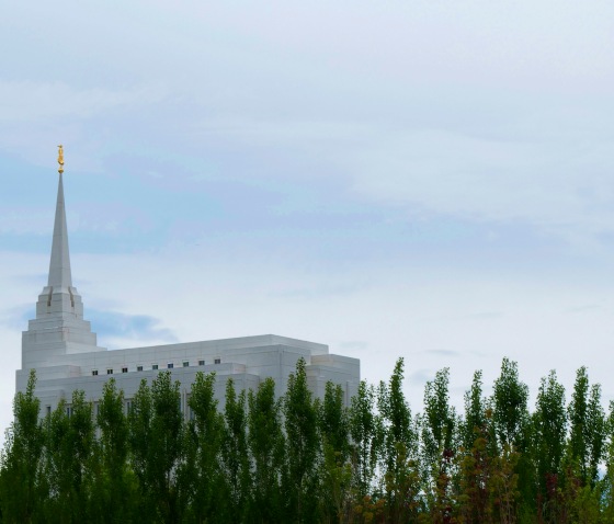
  2. Process (Programs, Tools, Skills, Steps taken while designing): I added the picture of the bride into the right size (8.5 x 11) of the document. Then I opened in another document the picture of the temple. I used the Lasso tool to crop the temple picture to the right size. I added the temple picture to the bride’s picture and played with it around to see where it fit right. I chose to put it on the left side of the bride (or back side), in order to show how the temple can help become more virtuous. I then added a mask over the temple to blend it into the bride. Then, I added the quote and fix it with different fonts and sizes so that it would show a hierarchy. I chose the colors of the text depending on the colors of the bride (skin) and the background (lime).
  3. Message: I wanted to show the importance of virtue and the temple and how it can make a person happy.
  4. Audience: My target audience is the youth, specifically the young women.
  5. Top Thing Learned: The thing I learn the most was to use the mask tool and blend images.
  6. Filter / Colorization used and where it was applied: None.
  7. Color scheme and color names: Triadic – Lime, Indigo, Brick
  8. Title Font Name & Category: Billabong regular – Script
  9. Copy Font Name & Category: Times New Roman – Oldstyle
  10. Thumbnails of Images used:
  11. MAC_2009MAC_8692


11.  Sources (Links to images on original websites / with title of site): Taken by Martin Carrasco Photography. Personal photos.

P3: Photodesign

P3MariviRuedaNEW

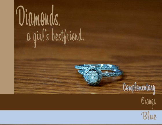
  1. Description: Demonstrate a good quality photo with different editing skills. Added color into the poster to match with the photo.
  2. Process (Programs, Tools, Skills, FOCUS principles): First, I sketched an idea of what I wanted to do. I took pictures of different and decided to focus on the complementary color scheme- blue and orange. I used a Nikon camera and added the photo to Photoshop to do some edit. I used the sharp tool around the ring. Then, added the basic edit tool such as brightness, color balance, and saturation. I opened a new document on Photoshop (8.5′ x 11′) and added the image to the blank document. Then, I added three rectangular lines (two at the bottom and one at the left side). I used the lasso tool to select the ring area and make it more blue rather than silver. I added the color swatches on the bottom and there it is.
  3. Message: My purpose of the design is to communicate that girls/ladies like jewelry. I wanted to keep the colors simple and formal.
  4. Audience: Male students who are in a current formal relationship.
  5. Top Thing Learned: The most important thing that I learned was to not flatten the layers right away. Instead, to wait and review the design before finalizing it.
  6. Color scheme and color names: Complementary – Blue and Orange
  7. Title Font Name & Category: Billabong Regular – Script
  8. Copy Font Name & Category: Billabong Regular – Script
  9. Thumbnail of original, unedited image inserted Date and location you took the photo(s): 

    _DSC0708

    Tuesday May 19. Inside Hinckley building.

P3 Activity: Photography

Horizon

Light 1 – Outside

Light 2 – Inside

Focus 1 – Foreground

Focus 2 - Background

Focus 2 – Background

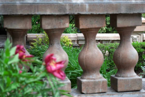
Composition 1 - Thirds

Composition 1 – Thirds

Composition 2 - Lead Room

Composition 2 – Lead Room

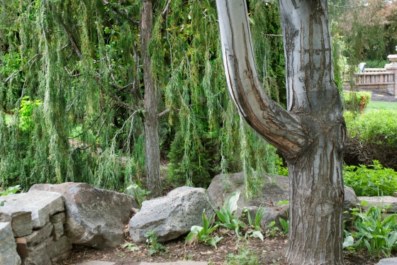
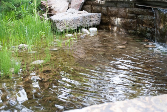
I really enjoyed working with a camera and Photoshop. There were new skills that I learned that helped me understand a better view or perspective of images. Since this was my first time using a camera, I had to ask a classmate (with more experience), if she could help me. She taught me the different things I could change in the camera so that when I upload the pictures into Photoshop to edit, much editing is not necessary.

The process of this activity took not long to produce. I decided to go to the Gardens on campus. I figured there would be a lot of different places to get cool ideas for this activity. I started my activity by taking the Focus photographs. I enjoyed this part of the activity because I could have taken photos of any place. Then, I moved on to Light. This was a little hard, mostly for the outside, because the day light was terrible. I had to do much editing in order to see and appreciate the picture more. Lastly, I did the Composition. In this part of the activity, I struggled a little more because I hadn’t become an expert on Thirds and Lead room. After this assignment, for sure I will see these two subjects.